LAÍSSA MOREIRA
SOKO Visual System (in progress)
Design
2023
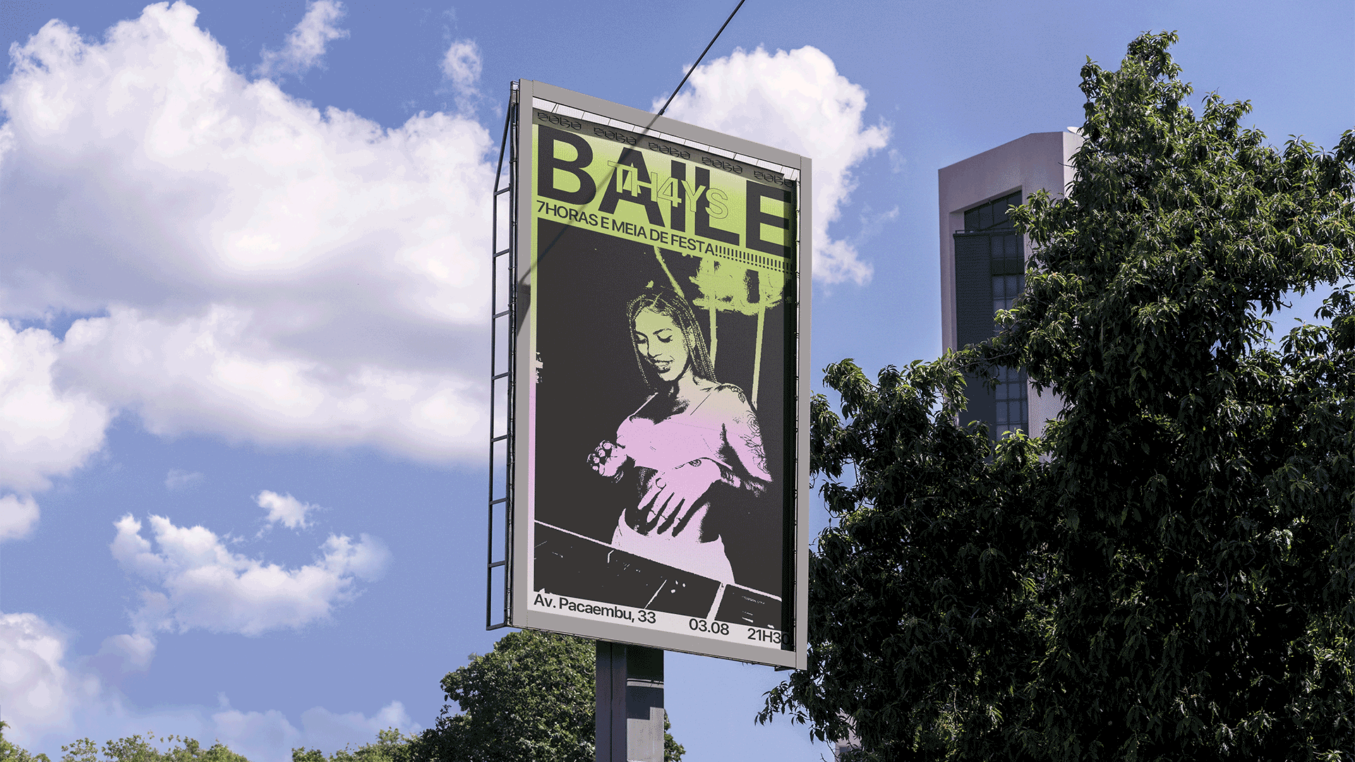
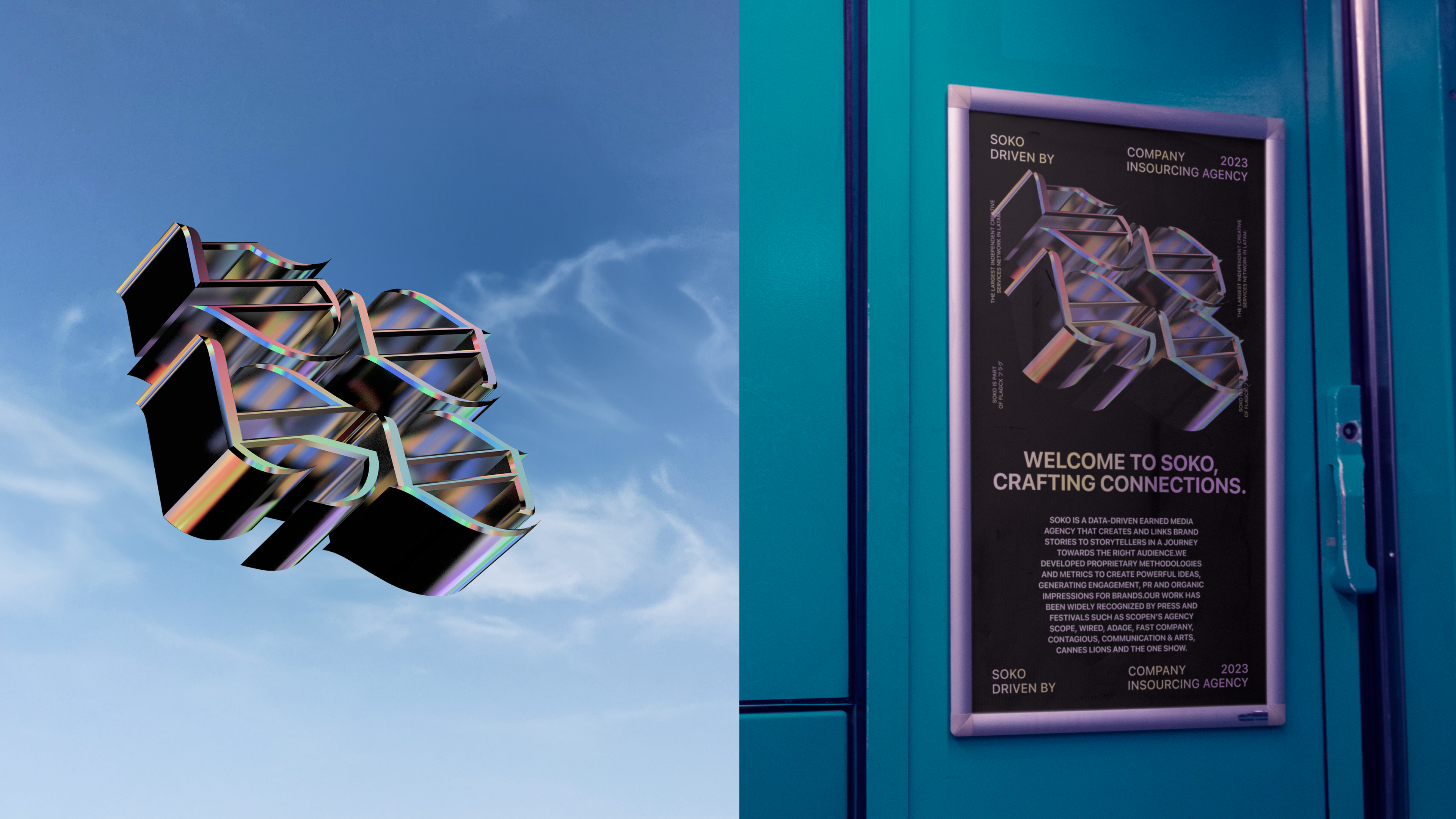
Developped a comprehensive visual identity system for SOKO, building upon a selection of pre-existing brand elements. Our approach was centered around enhancing and integrating these existing assets - namely the logo, a series of 3D objects, and distinct gradient schemes - to create a cohesive and dynamic visual language.
︎︎︎Team
Art direction and Design:
Laíssa Moreira and Juliano Shimizu
Client: SOKO
Agency: SOKO
Key Components:
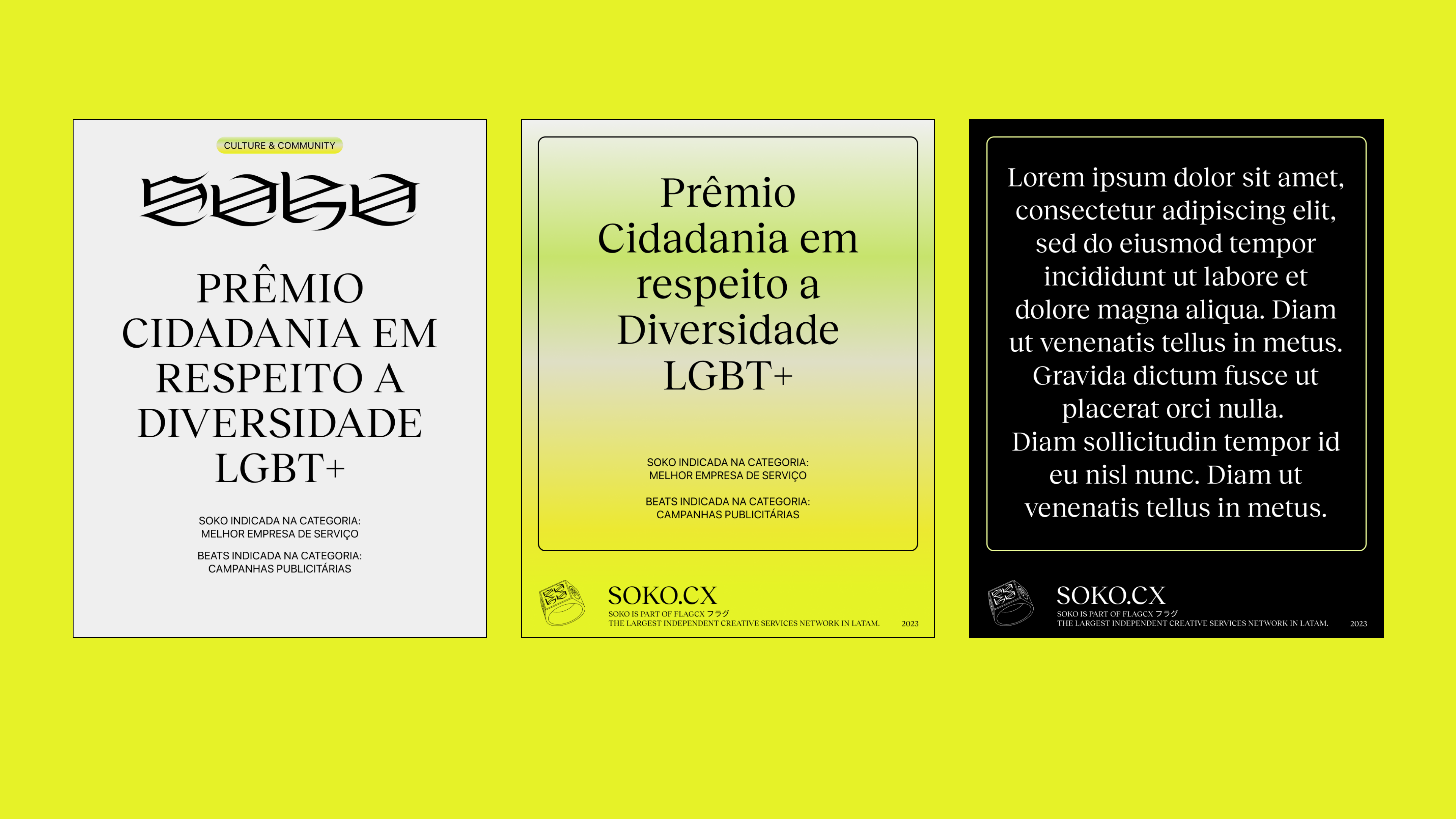
01. Logo Enhancement: We refined the existing SOKO logo, ensuring that it aligns seamlessly with the new visual identity. This involved subtle adjustments to its design to enhance its visibility and compatibility with the other elements of the brand's visual language.
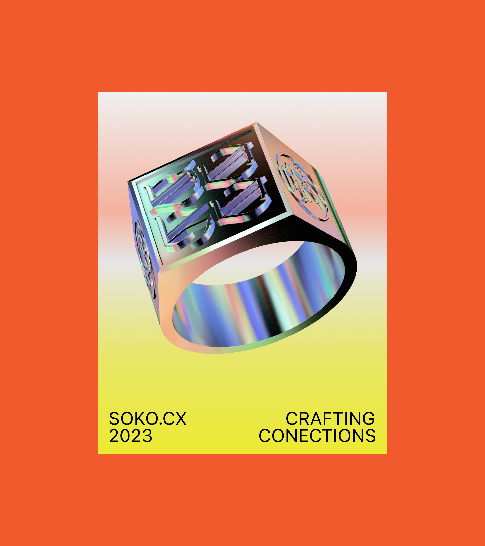
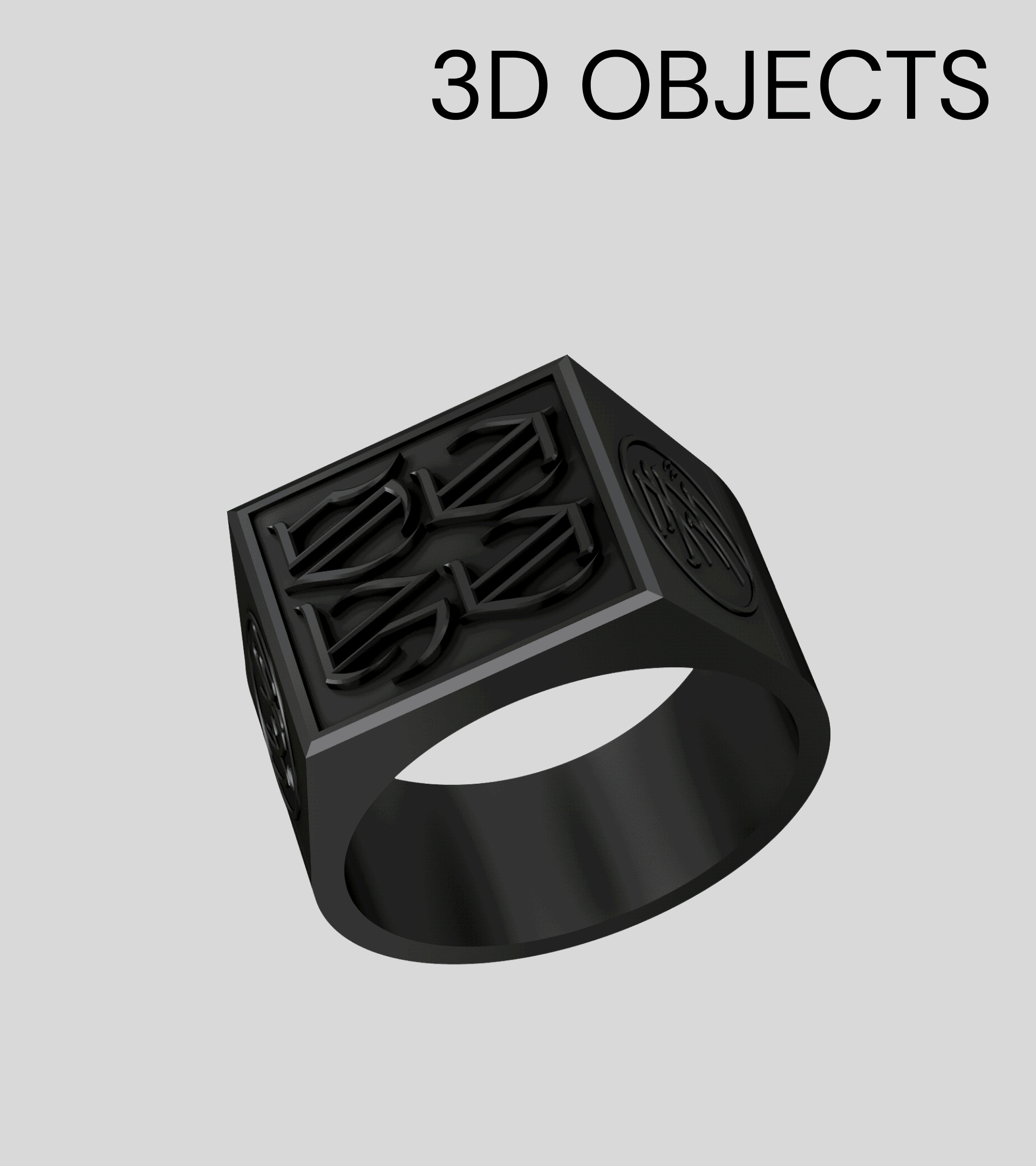
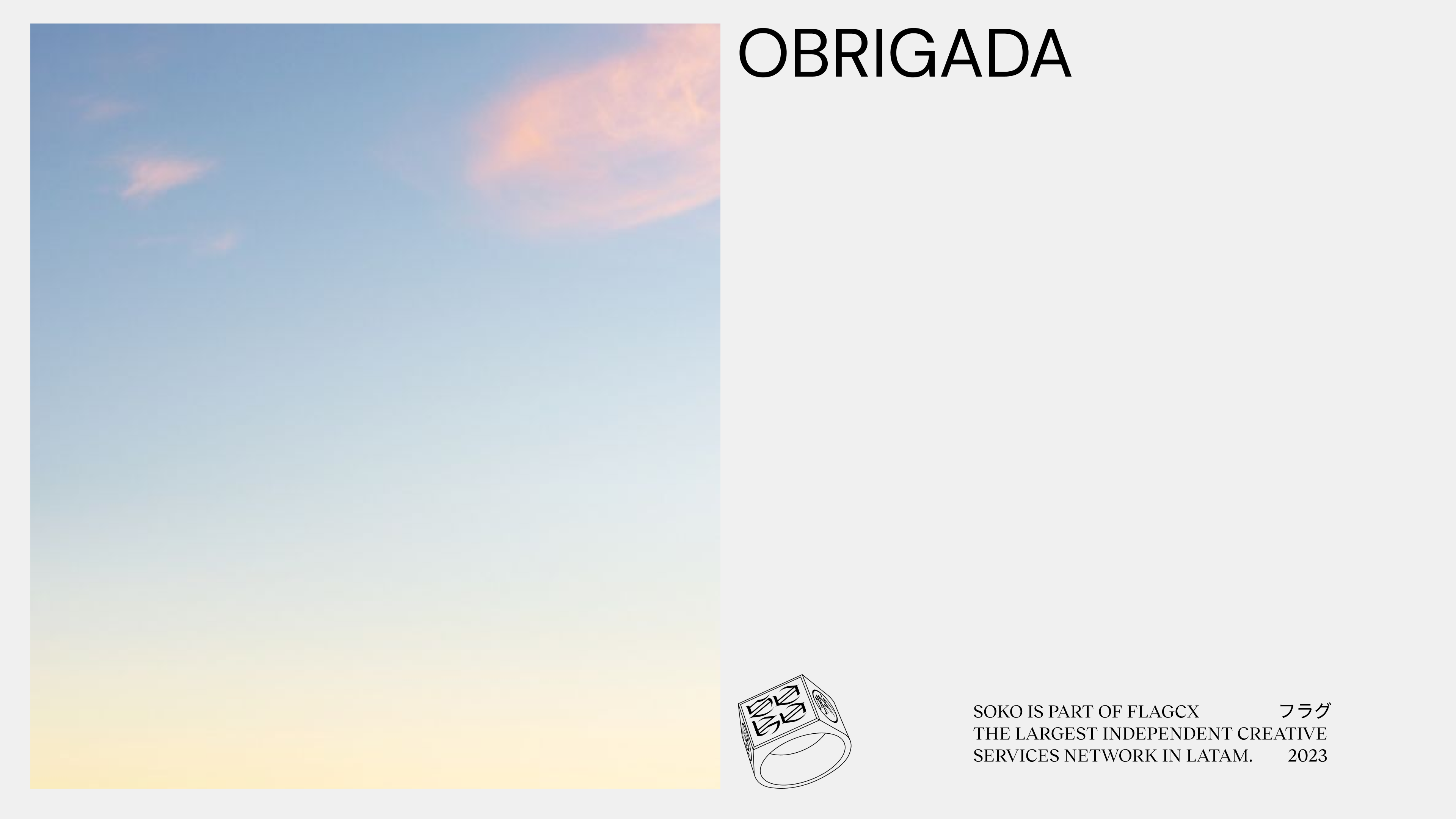
02. 3D Objects Integration: A critical aspect of our strategy was to effectively incorporate the pre-existing 3D objects into the visual identity. We focused on creating a harmonious balance between these objects and the other design elements, ensuring that they contribute to a unified brand experience.
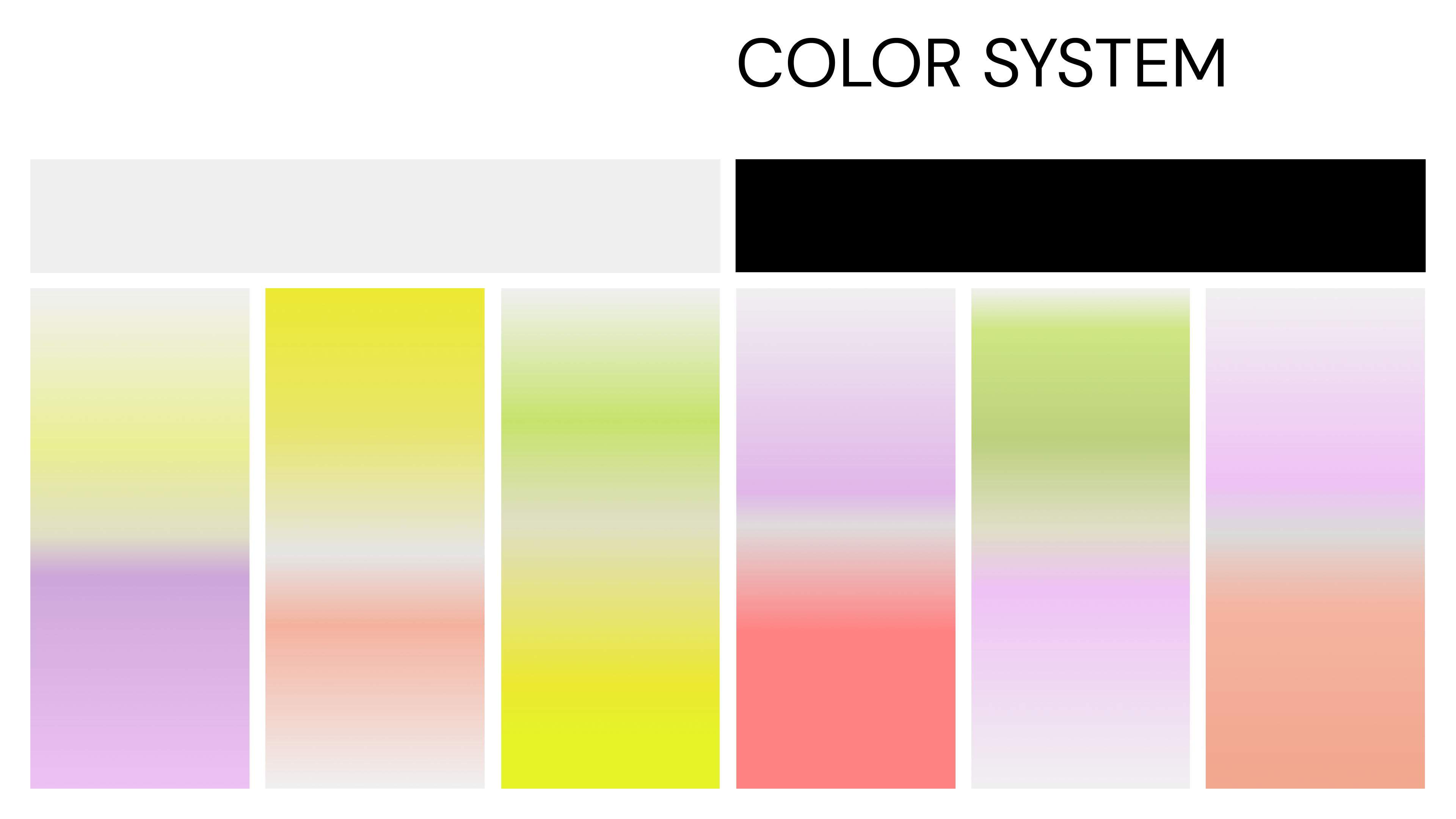
03. Gradient Utilization: Gradients were a significant component of SOKO’s existing assets. We carefully evaluated and selectively adapted these gradients to enrich the visual identity. Our aim was to use gradients not just as a background element but as an integral part of the overall design, contributing to the brand's narrative and emotional appeal.